
 REACT
Kokonut UI · Component
Flick Card
ComponentReact TSXKokonut UIMIT
Animated link button with a vertical text slide on hover and default and ghost variants, built with React, Next.js Link, and Tailwind CSS.
npx shadcn@latest add @kokonutui/slide-text-buttonMIT license: free to use, change and ship in personal and commercial projects. Keep the copyright notice in your project.
REACTKokonut UI · Component
Flick Card
 REACT
Kokonut UI · Component
Halftone Background
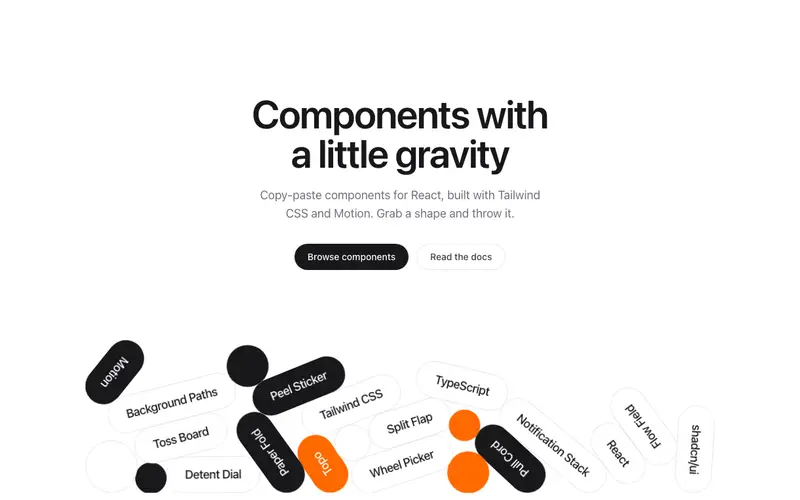 REACT
Kokonut UI · Component
Shape Hero
 REACT
Kokonut UI · Component
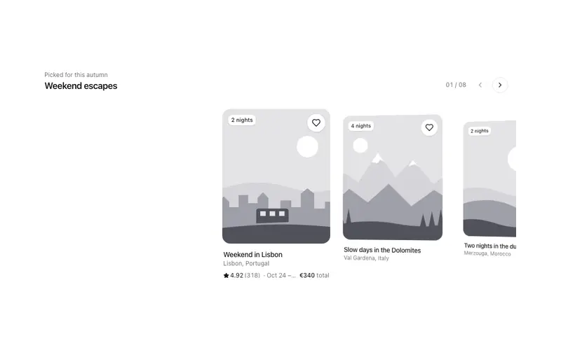
Momentum Rail
 REACT
Kokonut UI · Component
Cradle Text
 REACT
Kokonut UI · Component
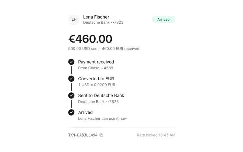
Currency Transfer
 REACT
Kokonut UI · Component
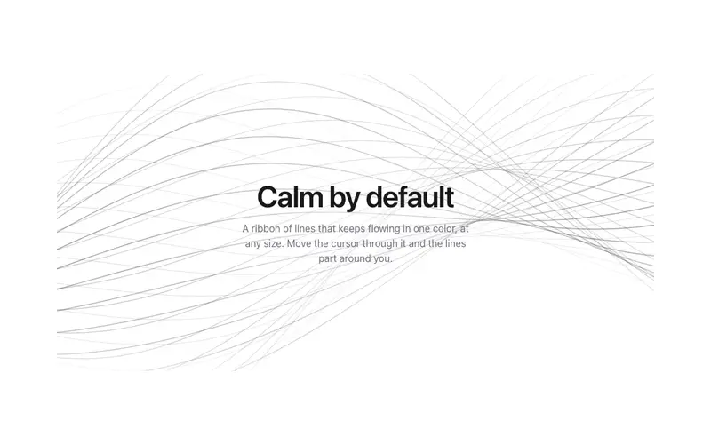
Background Paths
 REACT
Kokonut UI · Component
Dot Field